For my second Flatiron School project, the requirements were to build a Sinatra Model-View-Controller application using ActiveRecord. While my first project used a Command Line Interface, I was excited to build something that could actually be viewed in a browser (a real live web app!).
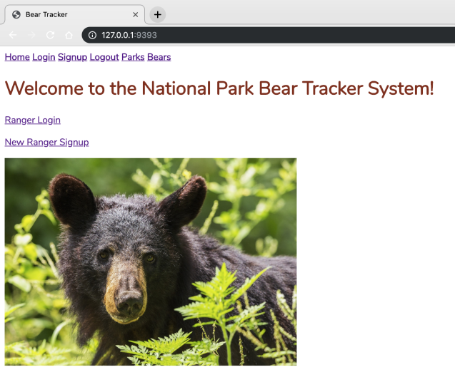
This app also differed from my first project in its intended users. My first project was consumer facing, designed for anyone with an interest in camping at Joshua Tree National Park. This project, on the other hand, is non-consumer-facing. It is designed for government employees, specifically National Park rangers, to use to keep track of tagged black bears and brown bears in the Pacific Northwest. I enjoyed using my imagination to decide how to make this app useful for a very specific set of users, while also trying to maintain a simple and pleasant user experience, which is always good for employee morale!
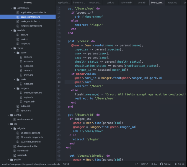
The app contains three models—Park, Ranger, and Bear. In terms of the model relationships, a park has many rangers, and a park also has many bears. A ranger belongs to a park, and a bear belongs to a park. In addition, a ranger has many bears and a bear belongs to a ranger. While in the real world, a park ranger may work in more than one park, for the sake of simplicity, I decided that a ranger would belong to only a single park. For me, the relationships between the models was the most confusing aspect of the project, and I changed them several times before deciding on what made the most sense. I used three separate controllers, one for each model, in addition to the Application Controller.
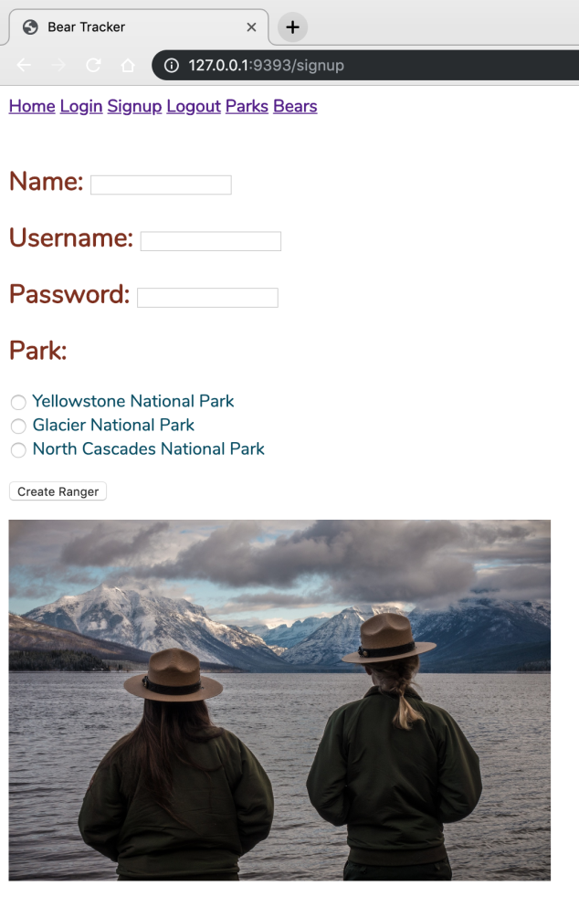
The ranger is also the user. Rangers would create an account with a name, username, and a secure password, and the username must be unique. Once logged in, rangers can create (tag) new bears and view all of the bears (not just their own). However, rangers may only edit or delete their own bears. This prevents them from accidentally or purposely sabotaging the work of their fellow rangers, and keeps track of which rangers are making changes to bears.
Next, I had to decide what kind of information would be stored in the database. What information would park rangers need to have about the individual bears living in and roaming our national parks? I decided that each bear would have a name, a species (North American Black Bear or Brown Bear), a sex (male, female without cubs, or female with cubs), an age, a health status (good, fair, or poor), a habituation status (whether the bear has shown any habituation to or aggression towards humans), and a ranger id. Every attribute would be required except for age, which I reasoned may be unknown.
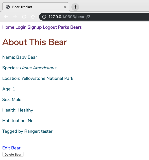
The app’s three main views that display information from the database to the ranger include the bear index page, the bear show page, and the park index page. The bear index page shows all the tagged bears (from any ranger) with their id. Each bear has a “More Info” link that leads to that individual bear’s show page, which lists all of the bear’s attributes. Once again, this information is available to any ranger that is logged in. The park index page lists the three national parks, the location state, and the number of tagged bears in that particular park.
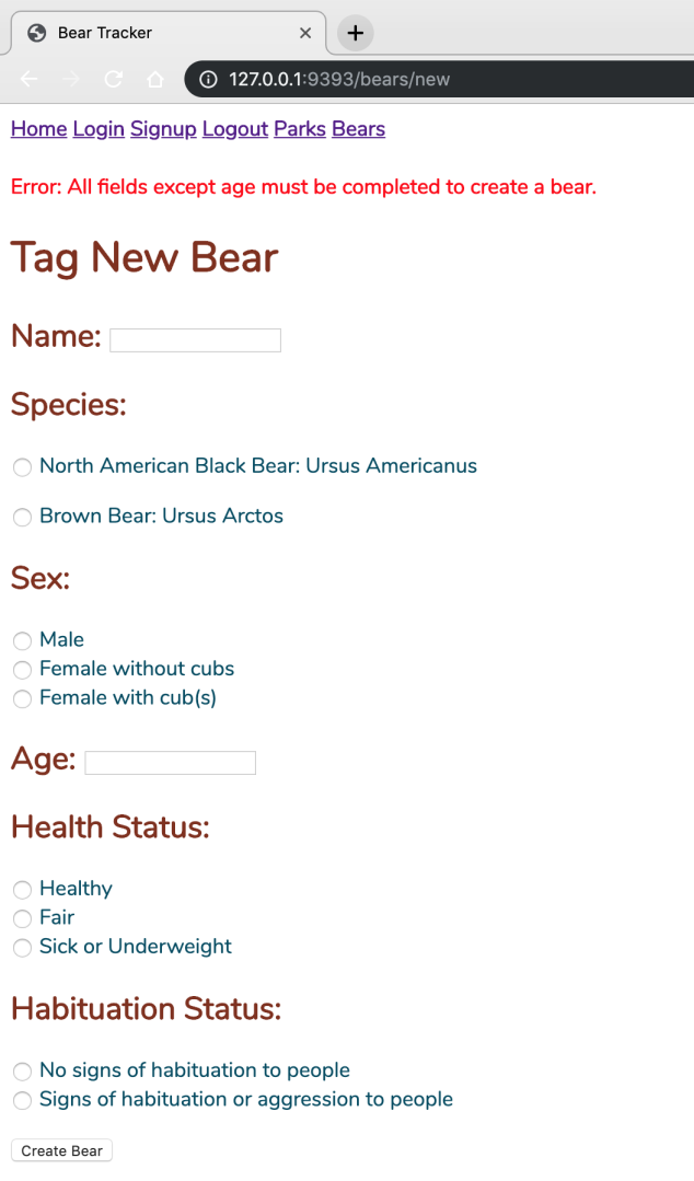
I decided to tackle the optional challenge of adding error messages if the input validations were not met. I used Rack Flash for error messages that would be displayed if all required fields were not completed when creating a new ranger or a new bear, or if the ranger username was not unique.
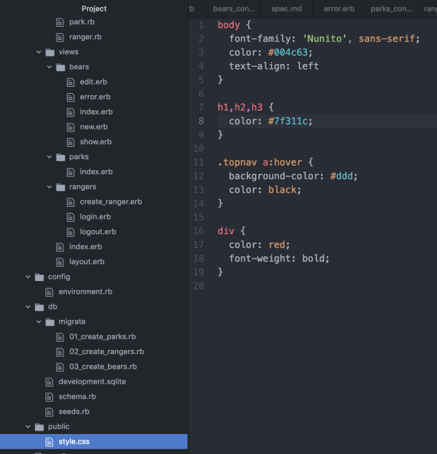
Finally, I added some pictures of black bears and grizzly bears, and a few shots of the three national parks, for a bit of visual interest. I also added minimal CSS styling (a few font and text colors changes), and used a single layout and CSS file for the entire application for simplicity and uniformity.
Overall, I found this project to be fun and rewarding, albeit occasionally frustrating (two straight days of debugging with help from my project advisor revealed that a single period had to be removed!). I liked how this project felt like something I could realistically be creating as a developer in the “real world”.